Global Forces Shaping the Future of Business & Society
McKinsey’s managing director, Dominic Barton, and other partners discuss global trends and how to act on them. Full story requires subscription.
Hat tip to @benhinnen
Peter Merholz Presentation: Upgrade Your Mandate
Higher ed organizations are poorly structured to create exceptional customer experiences across all points of contact. In this talk, Peter Merholz discusses the symptoms of broken organizations and how they can become truly customer-centric.
Tension Between Marketing and Usability: Part 2
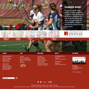
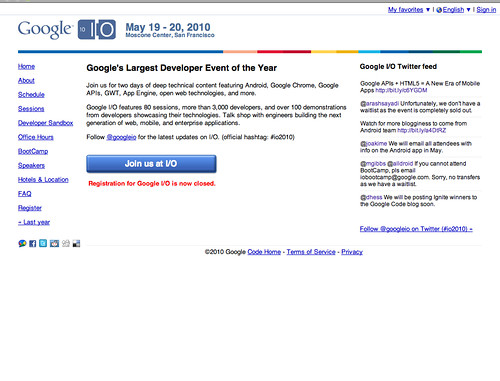
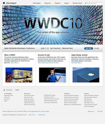
In my previous post about the push and pull between marketing a site and making it usable, I try to make the case that the DU site leans too heavily toward marketing when all available data suggests usability is more important. However, on second glance, I believe I need to clarify my stance and I’ll use the home pages from Google and Apple’s developer conferences as an example.
My bias is toward a balance between marketing and usability, but the bias gives more initial credence to usability than to marketing. Why? Because you can market the hell out of a site, a subsection or page, but if people don’t know it exists, then it doesn’t matter. That’s my main criticism of the DU homepage- It looks great (which is valuable in and of itself), but it comes at the expense of visitors (prospective students) getting their tasks completed slower and more inefficiently. The most powerful way to manage this tension is to 1) ensure your basic usability requirements are met and 2) make that basic usable framework as beautiful as possible.
If we look at the Apple and Google examples on this page (you can click them to access full size versions), you see this 1-2 approach put into practice. Google is a usable site. It gives visitors a short overview of the conference, easy to find/use links to additional information and a big button to join. But is it beautiful? Has it leveraged good marketing principles? Well, it does provide user generated content to breathe some life into the page, but I would argue that it’s not an engaging presence. It has leaned too far toward usability by disregarding the power good marketing would provide.
Apple’s page also provides basic information on the conference, links to additional information and a big button to join. The difference is that Apple takes that basic usable form and packages it with more marketing muscle. The page is beautiful. It’s engaging, active and makes me want to go in order to be a part of the energy depicted. This is a page that has found a good balance between marketing an usability.
Both conferences, being as high profile as they are, will undoubtedly sell out (Google’s already has as of this writing) so you could make a counter argument that Google’s lack of marketing didn’t hinder them. In fact, they likely saved money and time by avoiding the marketing point of view. True enough. But which conference do you want to be a part of?
Tension Between Marketing and Usability: Part 1

Nick Denardis of EDU Checkup critiqued the University of Denver’s redesign and gave it a 94%. Pretty good. He liked the strong visual impact of the homepage, that content was geared toward addressing student needs and that the underlying code was done with SEO and accessibility in mind. What Nick didn’t know, couldn’t know, was the drama and politics that culminated in this particular design. One aspect of this hidden world is what I’d like to discuss today- the tension between the marketing and usability camps. While I’d like to think that both can (should) co-exist to support one another, its been my experience that they don’t. An organization tends to lean one way or another, many times leaning so heavily one way or another that the overall site experience suffers and, therefore, so do visitors.
Before we dive into the details, we need to define marketing and usability. By “marketing” I mean a perspective that exults the intangible- largely subjective areas like branding and visual aesthetics. By “usability” I mean a perspective that exults the tangible- things that are perceived to be objective through testing and measurement like navigation and functionality controls, categorization and flow of information. I realize you may disagree on my definitions, but for the sake of argument, I’m not here to say one is better than the other so feel free to change the definitions in your own mind. I support both as I’ve defined them. You should ensure that your visitors are represented through testing and measurement, but you also need to be a leader sometimes and do what you feel is necessary even if it’s contrary to user’s wishes. The two can work in tandem, but so often fail to do so. However, that is not a recipe for disaster in and of itself.
A higher ed site could go in either direction. DU’s homepage is squarely in the marketing corner while the task of finding degree information is squarely in the usability corner, yet neither truly works as intended for me, not to disrespect Nick’s conclusions. The homepage does indeed have impact and bucks the usual higher ed trend, but does it work? It does if you want to grab attention and differentiate yourself from the pack (I’ll assume a prospective undergrad student audience). But do students want different or do they want ease of use or a sense of what life at DU is like or something else? Is the leadership inherent in publishing such a bold homepage good or bad? I’d argue that the homepage misses the mark.
I don’t see any reason to be bold here when so much of our own research and those of DU’s consultants over the years points to the fact that people researching what college to attend are more interested in getting the four big questions answered as opposed to being “marketed” to:
- Does the school offer the degree I’m interested in?
- Am I qualified to attend this school?
- Will I fit in socially/do I see myself being happy at this school?
- Can I (and/or my folks) afford it?
How many of these does the DU homepage answer (or how many of these questions can you easily get to if you make your way to an internal page within the DU site)? To varying degrees, there are links and clues for each of them, but they’re overwhelmed by the gigantic photo and audience links. This page is more about DU than it is about DU’s customers.
UPDATE 4/29/2010: I decided to expand on this idea using a non-higher ed example.
On Apple & Adobe Flash
There’s lots being said about Apple, Adobe and Flash support. This is the 6,342,213th opinion on the matter, but the first from me.
First off, what’s the big deal? Well, Adobe and Adobe/Flash supporters are up in arms about Apple’s increasing discrediting/dislike/disbarring of Flash on the Iphone and Ipad (no, I don’t capitalize iPhone and iPad according to Apple marketing- get used to it). They seem to think Apple owes its customers Flash support since so many websites out there power their video and whatever else with Flash. Apple says “Use open standards like H.264, HTML 5, etc.” The Flash crowd chants back “Those aren’t really open” or “Flash is as open as Apple’s narrow allowance for what can and can’t be on their products.”
All of this misses the point.
People who work in technology always prefer working on the newest, shiniest things. No one wants to code sites to work in IE 6 anymore and so we urge and beg people to upgrade while we implement more advanced tricks for the browsers that can handle them. HTML5 is the sexy new thing and people will quickly absorb it into their everyday even though much of the installed base of browsers don’t understand it yet. No technology lives forever, in other words, and Flash isn’t immune. Now, I’m not saying Flash is dead, far from it. But I am saying that it now has worthy competitors for such things as web video and, because of the competition, it’s a marked target.
By not allowing it on any of its devices, Apple is pushing the envelope of progress. Remember the criticism Apple endured when they decided not to ship computers with floppy drives anymore? Same thing only that this time, there are no analogous third party floppy drive makers to soothe people’s withdrawal. Apple has simply become more efficient at pushing us into the future whether we like it or not. But believe me, in the long term, we always like it.
UPDATE 4/29/2010: Steve Jobs posted a message about all of this. I get the sense that he makes the same basic claim I do: it’s time to move on.
Flickr for Photo Workflow
Many higher ed institutions use Flickr to share photos with their constituents. We launched DU’s Flickr site this summer. We also set up an “internal” Flickr account for our overworked photographer Wayne. It was meant to cut down on his daily grunt work and, I’m happy to report, it has. Here are some of the efficiencies it has garnered for him since its inception:
- Fewer in-person client reviews: Wayne is hired by various departments for photo shoots. After a gig, he used to schedule an in-person meeting with his client to review and choose the final photos that the client would ultimately take away with them. With the introduction of Flickr, he now uploads all the photos from the shoot into a Flickr set and gives the client access to it. The client then goes through and chooses the photos they wish to keep and deletes everything else. Our photographer saves himself an average of half a work day per week which frees him time to shoot other jobs, time to post process a client’s final selections and time to take care of non-billable, house cleaning tasks.
- Fewer photo searches: Wayne, as the sole photographer for the university, continually receives photo requests for use in various materials (marketing collateral, website, banners, etc.). Each request required him to go through his archives and ferret out an appropriate sampling of photos. Clients would either come to him in person to review or he would burn a CD with images and send it to them. With Flickr, he is now able to send people to an online archive of photos (in this case, he sends them to either the internal account or the public one). Once there, clients can download high res versions of anything they find and know that whatever they come across is approved for usage.
- Fewer variable costs: While not a huge area of servings, Wayne is able to cut down his use of CDs, jump drives, etc. because he now uses Flickr as a delivery method instead of physical media
Current Workflow
To make this work for Wayne, we plugged Flickr into his existing workflow so that his routine wouldn’t be overly disrupted. That process goes something like this:
- He downloads photos from his cameras into Lightroom
- He does a first pass through the raw files and throws out any obviously problematic photos
- He uploads the photos into a Flickr set using Jeffrey Friedl’s “Export to Flickr” Lightroom plugin
- If the set is uploaded to the public account, the set is marked as private and an automatic Twitter message is sent to one of our editors for title, description, and other metadata inclusion before being marked to public
- If the set is uploaded to the internal account, he gives his client access to the page and waits for them to choose the final shots they want
Truth be told, the above ideas are still being tweaked as the dust settles. Even so, Wayne has saved himself a good deal of work while our department has better served our internal clients as well as expanded our content offering to our various audiences (through direct hits to Flickr as well as embedding content into our core du.edu website- our annual report site is a good example of that).
Opportunities and Problems
One other workflow idea we’re working to incorporate now is to include the university’s archive team. The holy grail here is to have Wayne send his photos to archives for inclusion into their storage system and then pull the images we want to show in our public Flickr account from their database. The benefit gained is that Wayne has to send his work to archives anyway (per university policy) and, since the archive team appends a consistent set of metadata fields to each image, we can skip the step of using up an editor’s time to do the metadata work on the Flickr site.
Another idea we may try is based on an idea from Brad Ward. The jist is to use some fun gadgets to auto upload images in real-time from Wayne’s camera while he covers an event live.
One issue we’ve encountered is whether or not to make the internal account private or not. We didn’t, for example, want to post hundreds and hundreds of photos of any single event for public consumption, but Wayne has found that managing client credentials needed in order to access the private account was becoming more work than it was worth. So at the moment, all the photos are public, but not promoted in any way.
Other little issues have cropped up, but nothing that can’t be solved. We’ve reaped a lot of benefits from this move and are happy we did it.
Health Care Bill(s) & (Many) Higher Ed Websites
Some random connections:
- Similar in that the “solutions” don’t account for the real audience that matters: patients / students
- Similar in that those with ultimate decision making authority are swayed too much by lobbyists and insiders
- Similar in that those in positions of power tend to be too insular in their thinking and don’t go out of their way to listen to their constituents
- Similar in that opponents to change, regardless of whether it’s positive or negative change, use fear tactics as a mechanism to stop it (death panels / uncontrolled blog commenting)
- The end product is, at best, a grand compromise that makes everyone, even the most important people it targets, suffer in needless ways
- The old choice of “make it fast, cheap, or well- pick two” is turned into “make it fast, cheap, or well- pick all three” only to end up as “make it fast, cheap, or well- pick none.”
I’m sure there are others, but I’m already depressed having gotten this far.
Entropy and the Web
Websites want to be chaotic. They don’t like order, hierarchy, or staying on brand. Your efforts to tame it or control it are largely futile. The best you can do is point it in the right direction and then keep on eye on it. Turn your head for just a minute and suffer the consequences: broken links, inconsistent messages, oddball layouts, one time exceptions, and so on.
We usually clammer for more people, more money and more tools as salvation. They’re not. Those things will solve today’s problems, but new ones will arrive tomorrow. No set of widgets, plug-ins or third party add-ons will stop the inevitable. No workflow, processes or project manager from heaven stands a chance. Can you think of any CMS so good that it doesn’t let anything through the cracks? I can’t. Can we supersize it to an EMS and lick the problem? That’ll probably make it worse.
I bring all this up because after two days of great information and conversations at the AMA Higher Ed Symposium, It’s clear that higher ed is lurching forward in fits and starts to leverage all the wondrous new tools and services appearing daily on the Web. But in all the excitement and drama lies the everyday needs of everyone’s website. You’ve gotta remember to take care of the small, non-glamorous details that keep your site alive and well. Don’t lose sight of the daily grind because entropy is always there with you.
Is there hope? Well… just about the only thing any of us can muster in defense is vigilance. Stay attentive, be nimble and don’t let small problems fester into big ones. Keep the daily grunt work moving along efficiently, but also keep an eye on what’s coming up ahead. If the new thing on the horizon goes unchecked until it’s too late to deal with effectively, you lose. It’ll turn your hard work and good intentions into chaos and doubt. Don’t let it get to that.
Use link titles as a check on your architecture decisions
Recently at work, there was a discussion about link titles, their utility, when to use them, when not to and so forth. Link titles are those attributes you insert into a link tag that helps set expectations for users of where a link will take them. Conceptually, they’re easy to understand and rationalize. The hard part is actually writing them. I’m certainly guilty of writing banal descriptions that would make you wonder why I included one at all. But since no one ever calls you on them, it’s easy to let them slide. But over the years, I’ve come to realize that the seeming chore of title tags is actually an excellent check on your site’s information architecture. Let me explain.
Since title tags are an exercise in telling people what they’ll find behind a link before they actually go there, the act of writing it requires you to justify the relevance of the link in the first place. If you’re at Apple’s website on the Macbook page, you might see a link to their Macbook Pro page. Makes logical sense, right? If you’re interested in a Macbook, you might be interested in stepping up to a Pro model. A title tag might say “Step up to a Macbook Pro for added performance, storage, memory and more.” The sentence establishes relevance and a reason why you should click or not click. Job done, move on.
Let’s take another example, however. Let’s say you’re on a university’s annual report site, on any page. There’s a global link to the chancellor’s site. You write a link title that says… what? “Go to the website for Chancellor so and so.” No, that’s too obvious. “Get information about Chancellor so and so.” No, that’s not relevant to the annual report as a whole. “Get Chancellor so and so’s impressions on the year’s events.” No, if that information existed, it would be part of the annual report site itself.
The above reasoning hints at the utility of link titles. Writing them forces you to double check your architecture. Why does a link exist on this particular page or in the global nav? Is it relevant to include here versus over there? How does the inclusion of this link in this area on this page help the visitor accomplish their goals or further their aims?
All of these questions should have been asked early in the process, but things slip through or circumstances change. Writing link titles help verify that your user experience goals are kept intact and on track. Try it, it works.


